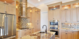
Deciding you want your kitchen to look newer and better is really just the first step. Sure, you know you don’t like your kitchen now and want a remodel, but what do you want your space to look like when it’s finished? That’s a tough one! A simple place to start is with the color of the paint. Picking the best colors for your kitchen is a big decision, so it may make it easier to look at some shades that are favored by many designers and other homeowners.
 #1 White. This is popular this year, and pretty much every other year! Since kitchens tend to be one of the busiest areas, and modern open floor plans mean you can see the kitchen from anywhere in the home, many think it’s wise to pick a color such as white or ivory for the walls. These light shades won’t bring too much attention to it, yet will look fresh and clean. Plus, it’ll be easy to add in pops of color here and there, like on your backsplash.
#2 Tones of Red. Red is believed to stimulate the appetite, so many people like to use it in the kitchen. You definitely want be careful with this bold color; it can overpower the room and make it feel too dark and small if the hue is too intense. Reds that have hints of pink can really work well, though. Something that is cranberry or raspberry would look striking with a backsplash and neutral countertops.
#3 Two Tone, Contrasting Colors. Color can be a great way to cleverly highlight architectural details of the room. To get the most out of it, you can combine two colors that naturally compliment each other. Try pink with navy, grey with a light purple, or of course the classic- black and white. Combining a bold color with a soft color in any hue will look like a professional designer took control!
 #4 Metallic. Brass and gold are coming back in a big way! Today’s homeowners are leaving behind the shiny polished chrome which conveys a more cool, modern, and sleek feel and instead changing to warmer accents with the brass and gold-toned fixtures. To pull off this look, you’ll want to find a metallic-looking paint color, like spun gold, and your kitchen will look amazingly opulent.
#5 Blues and Grays. If you’re a fan of a beach-inspired room, you’ll want the walls to match the rolling waves! If you stop in to Beattie Development’s Design Showroom, we have dozens of backsplash tiles that shimmer and will go perfectly with this choice of decor. Don’t forget to coordinate the light fixtures, bar stools, and cabinet color too!
There is a lot you can do with your kitchen, but it all begins with the color on the walls. Of course, if you want something totally unique and not mentioned here, Beattie Development’s Remodeling Team can handle that as well! To get started, please call Kenneth, our Remodeling Manager, at (239) 980-3801 or, if you prefer, you can also email him at Kenneth@beattiedev.com.
